By now there's been countless amount of rumors for larger screened iPhones. For example here's what iPhone 6 is supposed to be coming with. Most rumor postings only focus on the physical size of the device, which sure is important, but pay very little attention to the amount of pixels the screen would have.
The reason why the pixels matter is that Apple has been very conscious to avoid fragmentation in a device family, as much as it can be avoided. So when going to high-density "retina" displays, the pixels were scaled exactly 2x on both iPhones and iPads, so that old apps would run as-is without getting screwed by the aspect ratio (stayed the same) or pixel scaling (2x is as nice as it can get).
So when it comes to screen sizes and pixels on those screens, the real question is, how can you make the new "large" screens behave well in the non-retina + retina family?
The answer from the pixel side of things is relatively simple: have a scaling factor that is preferably whole integer (no decimals). Now, considering that iPad Mini (7.8" screen) sets a spiritual upper limit to the screen size, we are talking about screens with physical size of 4-7 inches diagonal. Within that range, doubling the pixels of retina screen (640px width => 1280px width) gets us into extreme dpi range, up to 600+ dpi. Those kinds of screens are fairly pointless to human eye (retina, i.e. ~326dpi is the sweet spot for a phone) – as well as very hard and costly to manufacture. On the other hand, Apple is probably not interested in going below retina resolutions, so 326dpi is the lower limit.
So 2 times the retina pixels is overkill. But there are no other integer-based scaling factors, right? Well, there is one: 1,5 times the retina. Because it is 3x the non-retina screen. The iPhone development environment continues to calculate sizes and positions in the non-retina scale, so introducing a "3x" scale as a sibling to "2x" scale is fairly trivial change. Of course the scaling of the pixels isn't perfect for old apps, but then again, retina (2x) has already very high pixel density, so with a even higher-dpi screen, the blurriness could be fairly small effect.
With 3x scaling, and iPhone 5/5S aspect ratio, we get 960px by 1704px pixels screen. At 326dpi (same as iPhone 5), that would translate to 6,0 inch screen, which could be a bit too large for Apple's tastes.
The iPhone 6 article linked above, speaks about 4,7" and 5,5" screens. Let's look at those sizes then.
The 4,7" would be the highest density display at 420dpi (again, 960px*1704px). While it's a high dpi, it still sounds doable. From user experience point of view, it would be merely 16% physically wider screen than the iPhone 5S, and would feel a lot like iPhone 5S, albeit with much more (non-discernible) pixels under the hood.
The 5,5" would have 355dpi screen, which is not much different dpi from the iPhone 5S. The device would feel much bigger though, nearly 40% physically wider and taller than iPhone 5S.
With the 4,7" and 5,5" phones, the existing apps would run just fine. Thanks to the extreme 420dpi resolution on the 4,7", the blurring from scaling the pixels of the old apps would be barely visible. On the 5,5" screen it would probably have small, but noticeable-if-you-look-for-it, effect.
...
All the discussion above, assumes that Apple is interested in keeping the contents on the screen exactly the same across the devices in the family (i.e. all the iPhones in this case). With larger screens it's of course possible to start re-layouting the content, for example putting more icons to the home screen and so forth.
However, at launch, iPad mini introduced a new physical screen size to the iPad family, and yet Apple kept layout the same as in original iPad. I foresee Apple continuing to use this pattern in iPhone-family too.
Showing posts with label resolution. Show all posts
Showing posts with label resolution. Show all posts
Sunday, April 13, 2014
Saturday, November 09, 2013
iPad Pro
So there's now iPad Air. Apple said it's a product that they have been wanting to do for a long time – a big tablet screen with the power of a laptop and weight + bezel of an iPad Mini. The device is just the screen – more than ever before.
But there's another omen in the name – Will there be an iPad Pro?
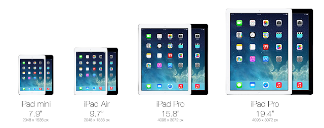
Of course, for Apple, the reason the make a significantly larger screen than the 9.7" iPad Air, is definitely not just because we can. A larger screen would not be mobile in the sense the current iPads are. It would be luggable, like the larger 15" and 17" Macbook Pro laptops are. Not convenient, but possible when the nature of work demands it. So definitely more work oriented device for professionals, just like the Macbook Pros are.
Who would use such a device and why? While the PC isn't going away anyway soon, Apple in full steam with Post-PC and any device that helps significantly to accelerate that trend, is an area of interest. Among all the Macbook Pro users, there are lot of creatives and art-oriented people who currently use Wacom pen surfaces, Wacom pens with auxillary screens and other assistive tools for design work and for digital art. When working on desktop, they might use external 24" or even 30" screen. That's a lot of expensive devices that are much less luggable than a large iPad with, maybe, a wirelessly connected pen.
Other potential groups of people are music makers, recording studios, DJs, VJs, planners and architects, movie makers, animation creators, modellers and so on. The available apps and the performance capabilities of the device are the only limiting factors and those are just a matter of time.
So how big would the Pro be then? The most likely thing to happen, is to do the non-retina to retina transition all over again. So double the amount of pixels and the size of the screen, for both iPad Mini and iPad Air. This would result in screen sizes of 15.8" and 19.4" diagonal (4096px by 3072px). These kind of screens would be used more like desktop computers, albeit not on flat table or in fully upright position. It would be placed mostly in landscape orientation in a slight angle – on top of a wedge or tilt stand – the way illustrators and architects work nowadays.

Wednesday, March 28, 2012
iPad Mini would be just like using an iPhone
There's been recently lot of rumors about the possibility of "iPad Mini", i.e. an iPad with smaller than 9.7 inch screen that the normal iPad has. Apple has for quite some time resisted the need for different screen sizes on the iPhone – it has stuck with the original 3.5 inch screen, while others have gone wild with larger screens. And to its credit, iPhone is definitely more pocketable than the larger mobiles.
The 9.7 inch iPad definitely is awesome for the immersive experience it is able to provide with so much screen estate, especially now that it has retina resolution (264dpi, viewed from 40cm distance). However, the e-reader market has been able to make a strong case (at least for some particular uses) for smaller-than-10-inch screens, with sizes closer to pocket book.
How is that possible? Well that starts with the Apple Human Interface Guidelines, which state any interactive area must be at least 44px by 44px in size. Additionally, you can sometimes tweak this a bit by providing much wider interactive area, while reducing the height slightly.
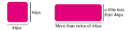 Every iPhone and iPad follow this same rule (retina displays just double the pixels). So on iPhone the smallest button has physical size of 6.86 millimeters, while on the iPad the smallest button is 8.47 millimeters. As you can see, the iPad buttons are physically significantly bigger. But due to longer viewing distance (40cm versus 28cm on iPhone), they don't appear to be so large as they physically are, when compared to iPhone.
So a smaller iPad Mini (at 163dpi) could use the smallest physical button size of 6.86 millimeters, while still following the Apple HIG, and more importantly, being able to use the iPad UI and apps just as-is.
Well, it's pretty hard to get a feel of a new device, without having a real prototype. But you can try looking and trying the full size version of the picture below inside normal iPad. It is scaled to be physically correct size, when viewed on full screen in iPad.

As a comparison, here's the screen of the original iPhone with the same button measurements.

The 9.7 inch iPad definitely is awesome for the immersive experience it is able to provide with so much screen estate, especially now that it has retina resolution (264dpi, viewed from 40cm distance). However, the e-reader market has been able to make a strong case (at least for some particular uses) for smaller-than-10-inch screens, with sizes closer to pocket book.
But that would require UI redesign?
One of the biggest practical reasons against doing another screen size for iPad is that it could very likely lead to UI redesign, as the physical size of the touch areas would be different. Both for Apple's apps and 3rd parties. However, Apple has been pretty genius with its math around screen sizes and pixels and resolutions. Essentially iPad Mini could use the same pixel size (1024x768) and UI as original iPad and still reduce the screen size to 7.85 inches (163dpi), while still being as easy to use as an original iPhone (also 163dpi).How is that possible? Well that starts with the Apple Human Interface Guidelines, which state any interactive area must be at least 44px by 44px in size. Additionally, you can sometimes tweak this a bit by providing much wider interactive area, while reducing the height slightly.
So a smaller iPad Mini (at 163dpi) could use the smallest physical button size of 6.86 millimeters, while still following the Apple HIG, and more importantly, being able to use the iPad UI and apps just as-is.
Ok, so how would that feel like then?
Well, it's pretty hard to get a feel of a new device, without having a real prototype. But you can try looking and trying the full size version of the picture below inside normal iPad. It is scaled to be physically correct size, when viewed on full screen in iPad.

As a comparison, here's the screen of the original iPhone with the same button measurements.

Once you go retina, you won't go back
After putting so much effort in showcasing how amazing the retina displays are, would Apple really launch iPad mini with a non-retina screen? While the R&D is ongoing, it's fine to use prototypes with 163dpi. When it comes to commercial releases, however, Apple is in no big hurry or pressure to et iPad Mini out of the door prematurely. So, maybe when it is possible to do 330dpi retina displays at 7.85 inches, the iPad Mini might become reality. As of March 2012 such displays are not available on the mass market. That kind of 7.85 inch retina display would have the same resolution as iPhone 4S and same amount of pixels as the new iPad, i.e. 2048x1536 at 330dpi.The crazy math
Should Apple ever do iPad Mini with the above measurements, the logical next step would be to do larger iPhone as well, with the iPad size physical screen buttons. This would translate to roughly 4,32 inch screen, but unfortunately the resolution would be "only" around 267dpi, which is below the retina threshold. Additionally, for a phone, the pocket-ability would suffer as well. So no magical solutions there.Tuesday, June 01, 2010
iPhone, iPad resolutions
Now that iPhone 4 is on the block as well, let's see how things fit in the screen ratio and resolution ecosystem of Apple. This is a continuation of the previous post I wrote on iFrame.
- iPhone (1st gen, 3G and 3GS): 480x320 ("a half" of iFrame, in width), approx 3.5 inches screen, 160 dpi
- iPhone 4: 960x640 (same as iFrame, in width), 3.5 inches screen, 326 dpi
- iFrame 960x540
- iPad (1st gen): 1024x768, 9.7 inches screen, 132 dpi.
- iMac (21.5 inch) 1920x1080 ("twice" iFrame, both in width and height), 100 dpi
- iMac (27 inch) 2560x1440 ("2.6 times" iFrame, both in width and height), 100+ dpi
iPhone 4 "doubles" the amount of pixels in both directions, resulting in total 4 times more pixels.
In a potential future "retina" iPad this kind of "doubling" would mean 2048x1536, i.e. about 260+ dpi. This is however well under "retina" requirement of 300+ dpi.
The minimum width would have to be around 2.3 times the original iPad width: 2330px. As this is well beyond Full HD resolution (1920x1080), the nearest "match" in the widths is the 27 inch iMac.
So, is Apple really going to the insanely high land also with iPad (2.5 times the original iPad resolution)?
- Retina iPad: 2560x1920, 9.7 inches screen, 330dpi?
At the very least it would be an unlikely bridge between the mobile and desktop pixels. It will be interesting how far Apple really wants to push the total amount of pixels in the "luggable screen size" of an iPad.
Update: Later blogosphere discussion correctly pointed out that "retina" effect is not simply a matter of "300 dpi". It's highly dependent also on the viewing distance. And between iPhone, iPad, laptops and desktop computers, the viewing distance varies greatly.
So what could the next retina displays be like? Tim Ricchuiti has made pretty well-informed guess (quoted below):

Subscribe to:
Comments (Atom)