By now there's been countless amount of rumors for larger screened iPhones. For example here's what iPhone 6 is supposed to be coming with. Most rumor postings only focus on the physical size of the device, which sure is important, but pay very little attention to the amount of pixels the screen would have.
The reason why the pixels matter is that Apple has been very conscious to avoid fragmentation in a device family, as much as it can be avoided. So when going to high-density "retina" displays, the pixels were scaled exactly 2x on both iPhones and iPads, so that old apps would run as-is without getting screwed by the aspect ratio (stayed the same) or pixel scaling (2x is as nice as it can get).
So when it comes to screen sizes and pixels on those screens, the real question is, how can you make the new "large" screens behave well in the non-retina + retina family?
The answer from the pixel side of things is relatively simple: have a scaling factor that is preferably whole integer (no decimals). Now, considering that iPad Mini (7.8" screen) sets a spiritual upper limit to the screen size, we are talking about screens with physical size of 4-7 inches diagonal. Within that range, doubling the pixels of retina screen (640px width => 1280px width) gets us into extreme dpi range, up to 600+ dpi. Those kinds of screens are fairly pointless to human eye (retina, i.e. ~326dpi is the sweet spot for a phone) – as well as very hard and costly to manufacture. On the other hand, Apple is probably not interested in going below retina resolutions, so 326dpi is the lower limit.
So 2 times the retina pixels is overkill. But there are no other integer-based scaling factors, right? Well, there is one: 1,5 times the retina. Because it is 3x the non-retina screen. The iPhone development environment continues to calculate sizes and positions in the non-retina scale, so introducing a "3x" scale as a sibling to "2x" scale is fairly trivial change. Of course the scaling of the pixels isn't perfect for old apps, but then again, retina (2x) has already very high pixel density, so with a even higher-dpi screen, the blurriness could be fairly small effect.
With 3x scaling, and iPhone 5/5S aspect ratio, we get 960px by 1704px pixels screen. At 326dpi (same as iPhone 5), that would translate to 6,0 inch screen, which could be a bit too large for Apple's tastes.
The iPhone 6 article linked above, speaks about 4,7" and 5,5" screens. Let's look at those sizes then.
The 4,7" would be the highest density display at 420dpi (again, 960px*1704px). While it's a high dpi, it still sounds doable. From user experience point of view, it would be merely 16% physically wider screen than the iPhone 5S, and would feel a lot like iPhone 5S, albeit with much more (non-discernible) pixels under the hood.
The 5,5" would have 355dpi screen, which is not much different dpi from the iPhone 5S. The device would feel much bigger though, nearly 40% physically wider and taller than iPhone 5S.
With the 4,7" and 5,5" phones, the existing apps would run just fine. Thanks to the extreme 420dpi resolution on the 4,7", the blurring from scaling the pixels of the old apps would be barely visible. On the 5,5" screen it would probably have small, but noticeable-if-you-look-for-it, effect.
...
All the discussion above, assumes that Apple is interested in keeping the contents on the screen exactly the same across the devices in the family (i.e. all the iPhones in this case). With larger screens it's of course possible to start re-layouting the content, for example putting more icons to the home screen and so forth.
However, at launch, iPad mini introduced a new physical screen size to the iPad family, and yet Apple kept layout the same as in original iPad. I foresee Apple continuing to use this pattern in iPhone-family too.
Showing posts with label apple. Show all posts
Showing posts with label apple. Show all posts
Sunday, April 13, 2014
Saturday, November 09, 2013
iPad Pro
So there's now iPad Air. Apple said it's a product that they have been wanting to do for a long time – a big tablet screen with the power of a laptop and weight + bezel of an iPad Mini. The device is just the screen – more than ever before.
But there's another omen in the name – Will there be an iPad Pro?
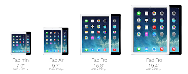
Of course, for Apple, the reason the make a significantly larger screen than the 9.7" iPad Air, is definitely not just because we can. A larger screen would not be mobile in the sense the current iPads are. It would be luggable, like the larger 15" and 17" Macbook Pro laptops are. Not convenient, but possible when the nature of work demands it. So definitely more work oriented device for professionals, just like the Macbook Pros are.
Who would use such a device and why? While the PC isn't going away anyway soon, Apple in full steam with Post-PC and any device that helps significantly to accelerate that trend, is an area of interest. Among all the Macbook Pro users, there are lot of creatives and art-oriented people who currently use Wacom pen surfaces, Wacom pens with auxillary screens and other assistive tools for design work and for digital art. When working on desktop, they might use external 24" or even 30" screen. That's a lot of expensive devices that are much less luggable than a large iPad with, maybe, a wirelessly connected pen.
Other potential groups of people are music makers, recording studios, DJs, VJs, planners and architects, movie makers, animation creators, modellers and so on. The available apps and the performance capabilities of the device are the only limiting factors and those are just a matter of time.
So how big would the Pro be then? The most likely thing to happen, is to do the non-retina to retina transition all over again. So double the amount of pixels and the size of the screen, for both iPad Mini and iPad Air. This would result in screen sizes of 15.8" and 19.4" diagonal (4096px by 3072px). These kind of screens would be used more like desktop computers, albeit not on flat table or in fully upright position. It would be placed mostly in landscape orientation in a slight angle – on top of a wedge or tilt stand – the way illustrators and architects work nowadays.

Wednesday, June 26, 2013
Authentic depth

With mobile user interface moving away from rococo -like extravagant decoration to more clean, "almost flat" designs, the animations and transitions of the UI have become more important. Increasingly inspiration is being drawn from the history of movies and animations to give a sense of depth to the interface – that some objects are above and some objects are below. But unlike the decorated, more static screens of the past, the almost flat interfaces behave more realistically, as if they are placed in a real three dimensional system, even if that world has some pancake-like tendencies.

Effects and animations that elicit the impression of depth, but which at the same time lack the authentic experience of dimensionality, can end up in detracting from the whole experience. Effects like blurring and transparency may reduce to being mere decorations, as in the interfaces of the past, rather than "...the way how it works.".
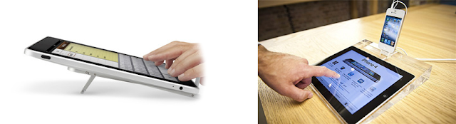
There are ways to design with depth so that it respects the authentic dimensional behavior. The Yahoo Weather app's animation and layering, e.g when content moves upwards, is one good example. For the iOS control center, the UI mockup video shown on the left gives some ideas how to approach the solution.
Wednesday, March 28, 2012
iPad Mini would be just like using an iPhone
There's been recently lot of rumors about the possibility of "iPad Mini", i.e. an iPad with smaller than 9.7 inch screen that the normal iPad has. Apple has for quite some time resisted the need for different screen sizes on the iPhone – it has stuck with the original 3.5 inch screen, while others have gone wild with larger screens. And to its credit, iPhone is definitely more pocketable than the larger mobiles.
The 9.7 inch iPad definitely is awesome for the immersive experience it is able to provide with so much screen estate, especially now that it has retina resolution (264dpi, viewed from 40cm distance). However, the e-reader market has been able to make a strong case (at least for some particular uses) for smaller-than-10-inch screens, with sizes closer to pocket book.
How is that possible? Well that starts with the Apple Human Interface Guidelines, which state any interactive area must be at least 44px by 44px in size. Additionally, you can sometimes tweak this a bit by providing much wider interactive area, while reducing the height slightly.
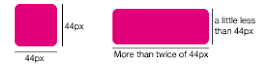 Every iPhone and iPad follow this same rule (retina displays just double the pixels). So on iPhone the smallest button has physical size of 6.86 millimeters, while on the iPad the smallest button is 8.47 millimeters. As you can see, the iPad buttons are physically significantly bigger. But due to longer viewing distance (40cm versus 28cm on iPhone), they don't appear to be so large as they physically are, when compared to iPhone.
So a smaller iPad Mini (at 163dpi) could use the smallest physical button size of 6.86 millimeters, while still following the Apple HIG, and more importantly, being able to use the iPad UI and apps just as-is.
Well, it's pretty hard to get a feel of a new device, without having a real prototype. But you can try looking and trying the full size version of the picture below inside normal iPad. It is scaled to be physically correct size, when viewed on full screen in iPad.

As a comparison, here's the screen of the original iPhone with the same button measurements.

The 9.7 inch iPad definitely is awesome for the immersive experience it is able to provide with so much screen estate, especially now that it has retina resolution (264dpi, viewed from 40cm distance). However, the e-reader market has been able to make a strong case (at least for some particular uses) for smaller-than-10-inch screens, with sizes closer to pocket book.
But that would require UI redesign?
One of the biggest practical reasons against doing another screen size for iPad is that it could very likely lead to UI redesign, as the physical size of the touch areas would be different. Both for Apple's apps and 3rd parties. However, Apple has been pretty genius with its math around screen sizes and pixels and resolutions. Essentially iPad Mini could use the same pixel size (1024x768) and UI as original iPad and still reduce the screen size to 7.85 inches (163dpi), while still being as easy to use as an original iPhone (also 163dpi).How is that possible? Well that starts with the Apple Human Interface Guidelines, which state any interactive area must be at least 44px by 44px in size. Additionally, you can sometimes tweak this a bit by providing much wider interactive area, while reducing the height slightly.
So a smaller iPad Mini (at 163dpi) could use the smallest physical button size of 6.86 millimeters, while still following the Apple HIG, and more importantly, being able to use the iPad UI and apps just as-is.
Ok, so how would that feel like then?
Well, it's pretty hard to get a feel of a new device, without having a real prototype. But you can try looking and trying the full size version of the picture below inside normal iPad. It is scaled to be physically correct size, when viewed on full screen in iPad.

As a comparison, here's the screen of the original iPhone with the same button measurements.

Once you go retina, you won't go back
After putting so much effort in showcasing how amazing the retina displays are, would Apple really launch iPad mini with a non-retina screen? While the R&D is ongoing, it's fine to use prototypes with 163dpi. When it comes to commercial releases, however, Apple is in no big hurry or pressure to et iPad Mini out of the door prematurely. So, maybe when it is possible to do 330dpi retina displays at 7.85 inches, the iPad Mini might become reality. As of March 2012 such displays are not available on the mass market. That kind of 7.85 inch retina display would have the same resolution as iPhone 4S and same amount of pixels as the new iPad, i.e. 2048x1536 at 330dpi.The crazy math
Should Apple ever do iPad Mini with the above measurements, the logical next step would be to do larger iPhone as well, with the iPad size physical screen buttons. This would translate to roughly 4,32 inch screen, but unfortunately the resolution would be "only" around 267dpi, which is below the retina threshold. Additionally, for a phone, the pocket-ability would suffer as well. So no magical solutions there.Wednesday, August 25, 2010
What IS iPad?

Remember the original iPhone launch? The outrage that it wasn't possible to create 3rd party apps for it? Why was it such a big deal? Especially considering that Apple just had released their first phone, with some music playing capabilities...
Or did Apple actually release a phone?
When looking at the big picture, I think what Apple did... was a general purpose device, with touchscreen optimized user interface. Yes, it happens to be able to make phone calls, but it can also do many other things.
The reason people carry a mobile phone around, is the ability to be connected to other people and other people being able to connect to you, when needed. Since people are not so comfortable with carrying big bunch of devices (requires more space, weight, ...), they quite often like the fact that they can use the phone also for other purposes than making calls.
Many owners actually use their iPhones for many things that are not about calling or texting, hence the wild popularity and download rates for thousands of apps in the App Store. Personally I'd probably be quite comfortable with an iPod Touch (a non-phone), if it weren't for the fact that internet has to be accessible from everywhere (cellular data), and that it's nice that people are able to connect to me via conventional ways, even if it's not that often.
Since iPod Touch carries the stamp of "iPhone without the phone", are the users of the iPhone and the iPod Touch using their devices for mostly the same purposes (except calling)? Probably not. Games have been hugely popular in App Store, and I'd be willing to bet that pretty many of those games are being played on iPod Touches..., because that's what the "younger kids" are having. It's a secondary device, mostly a portable game console, which they can carry around. No need for expensive phone plans, just keep the cheap phone, with maybe pre-paid contract. As a bonus, in home, school and other networked places, it becomes nice portable web and social device.
It's just a hunch, but women seem very interested in small portable music players to carry around. All those almost jewelry -like iPod Nano's and iPod Shuffles. It's humming along in gym, as well as on the way to work and back. For that, iPod Touch is a bit too big... unless it can provide enough appeal beyond having nice metal mirror on the backside. For some it may have that desirability, but then the lack of ubiquitous connectivity (for all the social apps) points towards an iPhone...
iPod Touches and iPhones are being used in homes, but there they need to compete with full-blown personal computers, as well as with wall mounted big TVs. And there, the small screen, no matter how high the resolution is, starts to lose it's shine. And currently the apps enabling Create and Modify activities are only starting to appear in the App Store.
For casual organizing of life, like noting down upcoming events, making shopping lists, sending reminders to friends... The small, instant-on touchscreen devices still can easily overtake TV or computers. But for big time entertainment, or for "getting things done", it falls a bit short.
...
In some ways, iPad is more of the same. It's still the same idea as iPhone already was, a very general purpose device. So it's not so much of a question what all kinds of things are possible (pretty much anything), but who is using it, in what context.
The only major difference to iPhones and iPod touches is the physical size of the display, which then ends up affecting the size of the device, the weight and consequently the ways to hold it and the portability of it.
Being more luggable and instant-on than a laptop, some internet-oriented road-warriors have found iPad being able to replace, at least partially, the use cases for laptop. It is more relaxed, almost leisurely device to use, compared to a full-blown laptop. And showcasing things to a client, on-the-go, is quite likely more attractive and immersive on a iPad, compared to a laptop screen (just give the iPad to the clients waiting hands). All in all, it will still take quite some time before iPad is a valid competitor to laptop for road-warriors though.
Compared to the iPhones and even iPod Touches, I think the iPad will spend much less time on the move. For an average person, it's probably a "device at home", "device at work" (e.g. medical field), or some other static context like that, with only occasionally taking it along, for example to show latest family photos and -videos to grandparents.
As a "home device" it probably is more entertainment oriented, whether it's news, books, web, social or games. It's the device when you want to "quiet down" on your own, to do your own stuff, rather than sit, agree on and watch the same TV programming with rest of the household. So you might sit on a sofa, or lie down on bed while toying with iPad.
Two groups of people who will actively use iPads are kids (especially younger than teens) and the elderly. The extent of it might still surprise some, in a year or two from now, as those groups are not traditionally typical for using the latest tech.
For kids the almost irresistible draw on iPad is it's intuitiveness. Just Google for iPhones and 1-2 year olds and you will get the idea. There are already, and there will be even more iPad apps specifically for kids. Parents have the power to choose what apps get on the device (by buying them) and kids have the freedom to explore the iPad without the need of parent to watch or guide over the shoulder. It's a win-win situation. Plus there's no need for separate game console, or DVD player. Some of the best selling children's books become animated and interactive, becoming even more attractive, and self-learnable.
Maybe un-surprisingly, the elders get attracted to iPad for the same reason the kids are. It's their "first computer" that they can actually use, without being intimidated or having fear of getting lost. There's the trusty, single, big, physical, black "panic button" that always gets you to where you started from.
And this is just the beginning of the journey.
...
Update: Mr. Bray points to tablet's advantage for (physical) shareability. Good point.
L:
apple,
computers,
design,
development,
history,
insight,
interaction,
interface,
intuition,
touchscreen,
trends,
UI
 0
comments
0
comments
Sunday, July 18, 2010
What Steve Jobs should have said, but didn't
Summarising the good words by others...
(John Gruber, John Syracusa)
On the external antenna design:
"Overall the iPhone 4 performs better than prevous iPhones. Apple is very confident in the chosen design, BUT the design does make an antenna weak spot explicitly visible to the end users."
On the reception issues:
"Vast majority of users do not have reception issues with iPhone 4. The left-handed "death grip" way of holding the phone does cause problems for some, although this is not entirely unique problem to iPhone 4. While the weak spot makes demonstrating the problem trivial, it should not be confused with the experience of actual use of the phone."
"Actually in parallel, a real bug has been identified that probably is causing a part of the problems people attribute to the antenna. Fix for the proximity sensor bug is coming in upcoming software update."
On the free bumber:
"Apple cares about all users. We do think most people will not need a bumber solely because of the antenna design. However, we are willing to give one free to anyone who feels they need a bumber. We will continue to improve the hardware and software in the future products."
Friday, April 30, 2010
The senior years of Flash
I'm pretty sure about this. The Flash (on mobile) is dead. It can take a year, or it can take 5 years. But it's dead in terms of being a major application development platform. Native mobile apps and HTML5 (on mobile web) will take over. On the otherhand, for prototyping on mobile (and elsewhere) Flash will be still very useful.
The final nail in the coffin was unrelently hammered in by these Thoughts on Flash from Steve.
In the desktop land, the user experience on different platforms is not so critically tied to "single app in full screen" and generally the platforms use very similar conventions, i.e. mouse, keyboard, app windows, icons (WIMP).
In the mobile land, the user experience is more varied, and a point of differentiation for the platforms and vendors (e.g. HTC Sense UX on top of Android UX).
As Adobe CEO puts it, the point of Flash is "code once, run everywhere", i.e. developers not having to target particularities of platforms. And this is the exactly wrong direction to go, if the user experience on mobile has high priority. The features that are "NOT common" across mobile platforms are the ones that make the mobile apps better than the average competitor.
So, to me this is one of the defining moments.
The same way the first iMac did away with Floppy drive (used CD instead) and legacy keyboard/mouse ports (used only USB instead). It takes a lot of guts and courage to cut the cords to the past and to legacy compatibility.
...
Things to watch in the future.
The death of discs
There's no BluRay in sight for Apple laptops. Maybe there will not ever be one, in terms of something that is permanently part of the laptop. There are already USB connected external drives available. Expect MacBook Air -like laptops taking over in the future. Movies can be bought, rented and streamed over the net. Software can be installed over the net (nowadays even Adobe Creative Suite!) or via another computer.
DRM-free movies / TV?
Not sure on this one, but Steve was pretty certain music needs to be DRM free. Could it be the same for moving pictures? Or is it entirely different business model?
Friday, January 22, 2010
Apple iFrame
Everybody and their mother is writing about Apple's panel. I think Gruber's thoughts and his links to other places on the topic are most relevant reading.
While some others are much more populistic and techy-minded, there's one good thought intermixed in the wishful thinking – the screen resolution.
Apple already has existing and in-use own video format called iFrame, which could easily be the name of the device as well...
What's interesting about that format is how neatly it fits in the different Apple screens:
- iPhone 320x480 ("a half" of iFrame, in width), approx 3.5 inches screen, 160 dpi
- iFrame 960x540
- iMac (smaller) 1920x1080 ("twice" iFrame, both in width and height), 21.5-inch screen, 100 dpi
At 10 inch physical screen size, the "native" iFrame would calculate to approx 110 dpi screen with 960x540, which would be much more "widescreen" form than iPhone is.
With iPhone form, the numbers could end up as: 960x640, ending up as approx 115 dpi for a 10 inch screen. Which does feel sensible, unless it's not high-enough-DPI for Apple as a touchscreen.
High-DPI version would be 1920x1080, which would be approx 220dpi for a 10 inch screen. Quite likely enough for Apple, even if Nokia N900 does 265dpi (800x480 at approx 3.5inches) :)
iFrame resolution, or some multiple of that resolution seems like quite likely to end up playing a significant role, in at least one of the dimensions of the Apple panel (...or Apple tablet :).
...
Update: It's 9.7 inches,1024x768 pixels at 132 dpi. Oh well, there goes the iFrame theory out of the window...
...
Update 2: Another view on the 4:3 resolution.
Update 3: Pro 4:3 arguments: It's not super-optimized for video watching, instead it's books, web, iWork. Plus, at 9.7 inches, it's physically much more comfortable to use when the device has 4:3 dimensions (landscape and portrait).
Wednesday, November 08, 2006
Matching the timing and the message
 It's always a both exhilarating and stupid moment to realize something that's been sitting in front of you all the time. One of those moments was when I understood why it really is so important for Apple the create best-of-the-breed Voice recognition and speech synthesis software into every major version of Mac OS X.
In a sense, the multi-sensory interfaces (not just visual and kinesthetic, but also haptic, auditory and tasty/smelly) is one most obvious ways to innovate in computer hardware and software. However, at the same time, it has the glass ceiling of the too popular WIMP -interface1) (i.e. Windows-Icons-Mouse-Pointer). The so called "direct manipulation" interface, that actually isn't one. A bit more direct one would be the one in the picture above, in which a pen directly moves the pointer on screen, not indirectly from a mouse pad, like it's typical nowadays.
So. My theory is that Apple recognizes both the need to get rid of the WIMP, and that there aren't good enough competitors for that interface yet (by good enough, I mean nearly perfect user experience, not just technically implementable). So Apple does the next best thing, continues to advance the alternative technologies of interaction and finds places where they can be used as secondary or alternative solutions. Or, as in this case, as a service to the disabled people, who can not use the WIMP in the first place.
 From this perspective, iPod represents a refreshing break from the WIMP-infested world. It's main way of interaction is a combination of gestures and auditory feedback. The control "wheel" is not haptic, finger just slides (no bumps), but the audio complements that sliding with ticking sounds that make it feel like finger would turn a discrete dial. The simple text menus do not employ fancy graphics, or icons. Hence less strain on eyes. Like Borat would say: Nice!
Inspired by: 1) Milekic, S. (2002) Towards Tangible Virtualities - Tangialities. Museums and the Web 2002 -conference.
Monday, October 23, 2006
Insight from the past
While it's often exciting to wait for new products from Apple and other design companies, it's not actually necessary to just speculate, collect rumours and get insider tips about the products.
Much of the important "big lines" (strategies) and many features of the products can be understood through insight by researching and understanding the moves of the past. One of the sources for this type of insight is RoughlyDrafted.
Note that there is, of course, a price tag on such insight - namely lot's of fluffy text, advertising and many requests from the author to promote the website. so YMMV.
After reading many of the texts, it makes one respect and appreciate Apple (those times that it's been successful) for the hard work of 1) finding a right product for the current time/age, 2) timing the launch of products, 3) iterative design, and 4) taking advantage of the concepting/previous attempts for products.
RD notes:
Apple
Important areas: Office (MS, ignorance of MacWrite) -> Desktop Publishing (Adobe & PS & PDF) -> Digital Media (Quicktime)
Historically Apple dependent on four major application vendors: Microsoft, Adobe, Macromedia, and Quark (all originally started their graphic apps on Mac)
Past projects:
- Powertalk (no standards, based on AppleTalk) -> similarities to Mac OS X: Bonjour, systemwide Keychain & Addressbook
- QuickDraw GX,
- A/UX -> idea recycled in Mac OS X (UNIX basis, but based on BSD)
- HyperCard -> Human-oriented programming languages: Applescript, Automator
- Copland (another) -> "System 8"
- Pink -> entirely new development platform for the Mac with IBM, code named Pink and Taligent
- Newton
- QuickDraw 3D
- Quicktime Interactive
- Common Point
- OpenDoc
- Dylan - futuristic coding language
- Future Shock
...
The new surge of Apple-made software:
- Macromedia KeyGrip -> Apple Final Cut
- Astarte's DVD technology -> Apple DVD Studio Pro
- Nothing Real's high end video compositing -> Apple Shake
- Emagic's professional level music studio tools -> Apple Logic Pro
- Apple Aperture
- & bundled non-pro versions of the apps: iLife (iMovie, iTunes, iDVD, iPhoto, Garageband, iWeb), iWork (Pages, Keynote)
- & non-bundled "pre-pro" (prosumer) versions: Final Cut Express, Logic Express
Mac OS X
- pre-emptive, multitasking (UNIX foundations), shell + UNIX toolchain
- object oriented programming: Cocoa (from NEXTStep)
- Bonjour
- systemwide Keychain & systemwide Address Book,
- iWork (key areas: Office + Desktop Publishing)
- iLife + pro apps -- taking advatage of quicktime (Key area: Digital Media (Content creation))
- Applescript (& Automator)
- Quartz 2D: entirely new drawing system: based on the open PDF model, with a standard implementation of the OpenGL specification. Replaced the archaic and proprietary QuickDraw and QuickDraw 3D.
iTV
- On Demand Commercial Content
- Personal Content
- Alternative Content
- Interactive Content (dynamic, not static media) -- The iPod way: Games, Widgets, Notes (+ VNC)
- Original Content (Apple as a Label and a Studio, Original Content for TV - not for Movies)
Apple's way up
- Good integration of software, hardware and services (holistic design)
- High quality software/hardware (distinctive, not bulk)
- Concentration on specific markets/key areas (office work, desktop publishing, digital media/creatives)
- Apple-created key applications
- Three levels of products, with high reuse in code: non-pro (consumer), pre-pro (prosumer), and professional
- Packaging the right mixture, pricing it right
- Better visibility - Marketing (e.g. I am a PC, I am a Mac -ads) and Retail stores (+ digital store)
Subscribe to:
Comments (Atom)