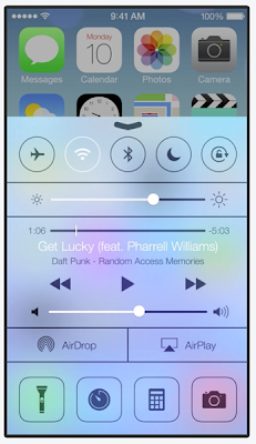
With iOS7 Apple is stepping up efforts in their design approach "...way much more than how it looks, it's the whole thing, the way how it works...". One of the key changes compared to the older versions of iOS, is the conceptual layering of various user interface elements. Visually this is achieved with parallax effect, blurred translucency, animations and other effects.
With mobile user interface moving away from rococo -like extravagant decoration to more clean, "almost flat" designs, the animations and transitions of the UI have become more important. Increasingly inspiration is being drawn from the history of movies and animations to give a sense of depth to the interface – that some objects are above and some objects are below. But unlike the decorated, more static screens of the past, the almost flat interfaces behave more realistically, as if they are placed in a real three dimensional system, even if that world has some pancake-like tendencies.
iOS7 is embracing this kind of depth and dimensionality, particularly with translucent white (and black) layers that blur the layers "below" them. However, from realism perspective, there's one gotcha with this approach – in real life only one of the "layers" can be in sharp focus at the same time. There are many places in iOS7 where this "authentic depth" is disregarded, one of the most obvious examples being the "Control Center" layer. When that layer is swept in from the bottom, it does blur the home screen behind it, except for the top part, where the home screen stays sharply in focus, albeit slightly dimmed.
Effects and animations that elicit the impression of depth, but which at the same time lack the authentic experience of dimensionality, can end up in detracting from the whole experience. Effects like blurring and transparency may reduce to being mere decorations, as in the interfaces of the past, rather than "...the way how it works.".
There are ways to design with depth so that it respects the authentic dimensional behavior. The Yahoo Weather app's animation and layering, e.g when content moves upwards, is one good example. For the iOS control center, the UI mockup video shown on the left gives some ideas how to approach the solution.

