So there's now iPad Air. Apple said it's a product that they have been wanting to do for a long time – a big tablet screen with the power of a laptop and weight + bezel of an iPad Mini. The device is just the screen – more than ever before.
But there's another omen in the name – Will there be an iPad Pro?
Of course, for Apple, the reason the make a significantly larger screen than the 9.7" iPad Air, is definitely not just because we can. A larger screen would not be mobile in the sense the current iPads are. It would be luggable, like the larger 15" and 17" Macbook Pro laptops are. Not convenient, but possible when the nature of work demands it. So definitely more work oriented device for professionals, just like the Macbook Pros are.
Who would use such a device and why? While the PC isn't going away anyway soon, Apple in full steam with Post-PC and any device that helps significantly to accelerate that trend, is an area of interest. Among all the Macbook Pro users, there are lot of creatives and art-oriented people who currently use Wacom pen surfaces, Wacom pens with auxillary screens and other assistive tools for design work and for digital art. When working on desktop, they might use external 24" or even 30" screen. That's a lot of expensive devices that are much less luggable than a large iPad with, maybe, a wirelessly connected pen.
Other potential groups of people are music makers, recording studios, DJs, VJs, planners and architects, movie makers, animation creators, modellers and so on. The available apps and the performance capabilities of the device are the only limiting factors and those are just a matter of time.
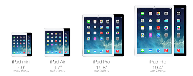
So how big would the Pro be then? The most likely thing to happen, is to do the non-retina to retina transition all over again. So double the amount of pixels and the size of the screen, for both iPad Mini and iPad Air. This would result in screen sizes of 15.8" and 19.4" diagonal (4096px by 3072px). These kind of screens would be used more like desktop computers, albeit not on flat table or in fully upright position. It would be placed mostly in landscape orientation in a slight angle – on top of a wedge or tilt stand – the way illustrators and architects work nowadays.
Saturday, November 09, 2013
iPad Pro
By
Mox
at
22:30
L:
apple,
design,
insight,
ipad,
mobile,
resolution,
retina,
touchscreen,
trends,
work
0
comments
Wednesday, June 26, 2013
Authentic depth
With iOS7 Apple is stepping up efforts in their design approach "...way much more than how it looks, it's the whole thing, the way how it works...". One of the key changes compared to the older versions of iOS, is the conceptual layering of various user interface elements. Visually this is achieved with parallax effect, blurred translucency, animations and other effects.
With mobile user interface moving away from rococo -like extravagant decoration to more clean, "almost flat" designs, the animations and transitions of the UI have become more important. Increasingly inspiration is being drawn from the history of movies and animations to give a sense of depth to the interface – that some objects are above and some objects are below. But unlike the decorated, more static screens of the past, the almost flat interfaces behave more realistically, as if they are placed in a real three dimensional system, even if that world has some pancake-like tendencies.
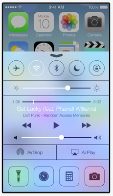
iOS7 is embracing this kind of depth and dimensionality, particularly with translucent white (and black) layers that blur the layers "below" them. However, from realism perspective, there's one gotcha with this approach – in real life only one of the "layers" can be in sharp focus at the same time. There are many places in iOS7 where this "authentic depth" is disregarded, one of the most obvious examples being the "Control Center" layer. When that layer is swept in from the bottom, it does blur the home screen behind it, except for the top part, where the home screen stays sharply in focus, albeit slightly dimmed.
Effects and animations that elicit the impression of depth, but which at the same time lack the authentic experience of dimensionality, can end up in detracting from the whole experience. Effects like blurring and transparency may reduce to being mere decorations, as in the interfaces of the past, rather than "...the way how it works.".
There are ways to design with depth so that it respects the authentic dimensional behavior. The Yahoo Weather app's animation and layering, e.g when content moves upwards, is one good example. For the iOS control center, the UI mockup video shown on the left gives some ideas how to approach the solution.
Subscribe to:
Posts (Atom)